
Lessons From Implementing Themes: Design & Engineering Perspective
Introduction
One of the most extensive and challenging projects we've tackled involved a significant overhaul of our CSS. We're talking about refactoring and deduplicating the CSS of over 400 components.The end goal was to introduce a light theme into an existing codebase built with Vue.js and Nuxt.js. This journey was full of learnings, and we are excited to share them with you from the perspectives of both a designer and a developer.
Starting with a Proof of Concept
Designer: Unlike most of the apps, acreom started dark. We knew we would love to introduce a light theme one day, but for a long time, our priorities were elsewhere.
Before we’ve actually started editing the codebase, we’ve built a light theme skeleton of one the screens. It served both as a proof of concept, and also as a way to explore the possibilities of our current color palette. It was our main aid when defining the right color hierarchy.
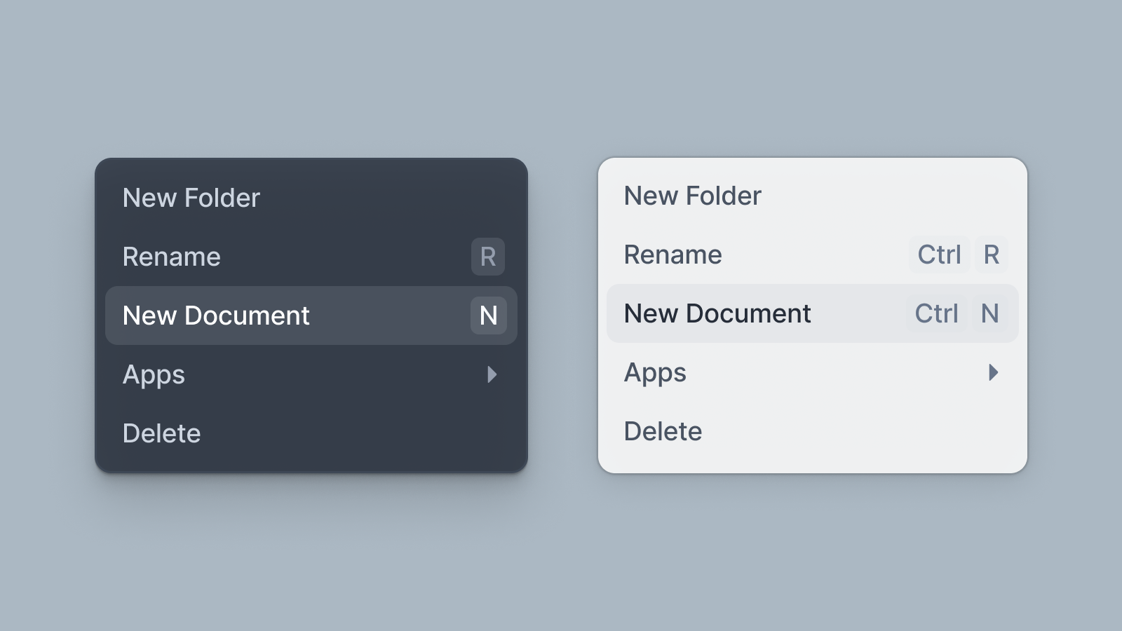
From the single proof of concept screen, we transitioned to higher fidelity details, while constantly tweaking the colors. After having a base structure nailed down, we’ve jumped into the first component: a dropdown. What led us to more detail. What makes dropdown work in light and what in the light theme?
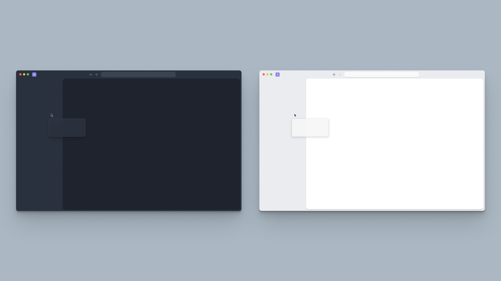
Dropdown is often the highest level of hierarchy, so it needs to stand out on various backgrounds. To make that
Dropdown on background without appropriate shadow.
on dark background you need to add an make component stand out from the background, inner shadow with lighter color will do that.
It took multiple iterations to match the visual / color hierarchy, define a visual language we want to use, and explore what works and what does not.
Developer: Once we had our first prototype in design, we began by implementing a single component - dropdown. Some questions we wanted to answer with this experiment were:
Do we use SCSS variables or CSS variables?
Do we define variables in component files or in one global config file?
How do we “toggle” the actual theme?
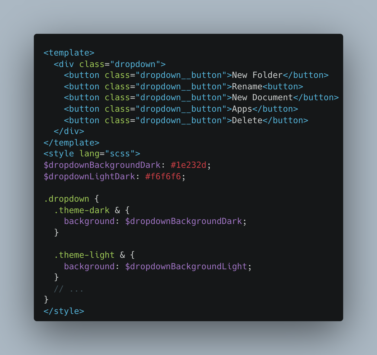
Our codebase is written in Vue and 99% of our components are written as single file components - html template, typescript logic, and styling in single file.
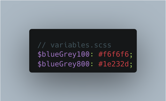
First prototypes defined the variables as SCSS variables saved in the component file.
Component:
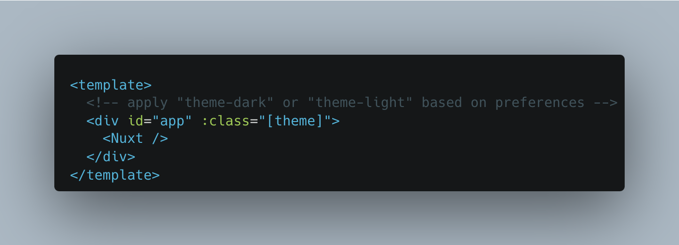
App root:
While this approach works it has several issues. First, saving variables for each component is not scalable in the long term. Second, there are patterns that repeat across the app so we don’t need to define the same colors each time. Third, the logic for applying theme color based on class in each component adds a lot of unnecessary code, plus adding more than one theme requires you to rewrite this everywhere.
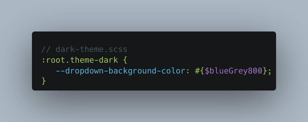
After several iterations and experiments we have ended up with the following implementation:
Variables:
Theme files:

Component:
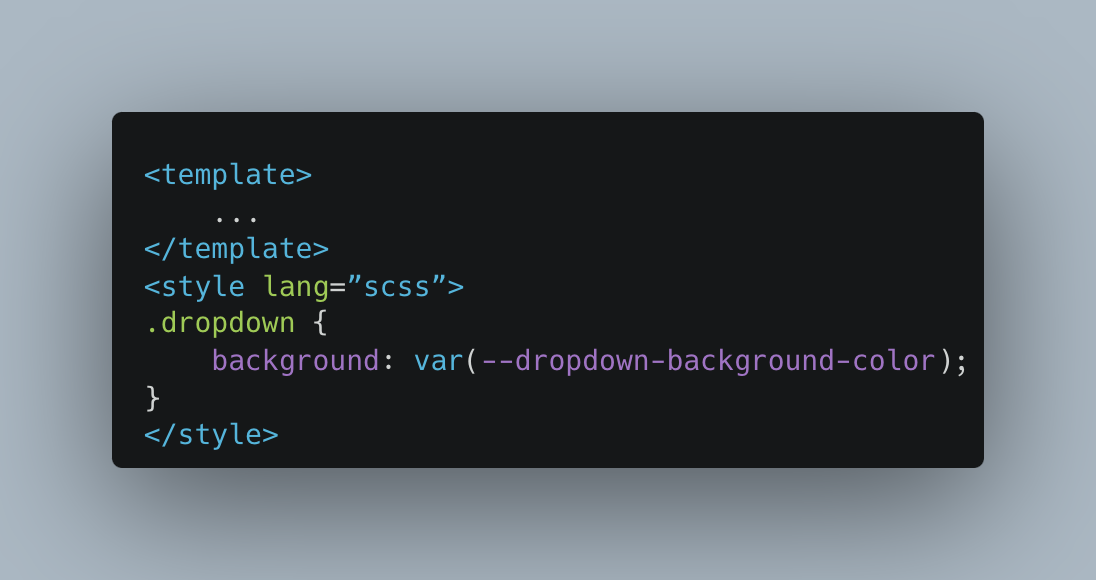
We ended up with a mix of SCSS and CSS variables. We could have gone with CSS variables only, but parts of our codebase, where themes are not relevant, still use SCSS vars. We have created a theme file for each theme. The theme file has all the variables from the app, similar to VS code or Sublime text theming. Adding a new theme is just a matter of duplicating existing theme file and updating color values. These variables are inserted to the :root css scope by changing the class (theme-dark / theme-light) on the root component.
Once we did this with a few more components, we were comfortable to go ahead with this approach.
Establishing Naming Conventions for CSS Variables
Developer: As rumour has it, the world of computer science has two hardest problems: cache invalidation and naming variables.
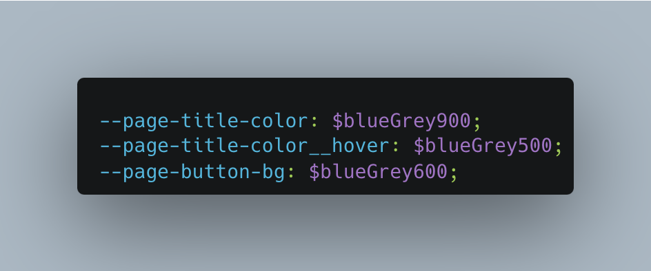
For our theming task, we have established a systematic approach for naming CSS variables, which proved to be crucial.
Our formula was straightforward, yet effective:
--{component}-{type}__{state}For instance:
This naming evolved organically as we refactored the application, ensuring consistency and ease of understanding across our CSS. It made our theming process a whole lot smoother.
Designer: Continuously, we’ve updated each of the core components listed below separately:
Colors, Buttons, Dropdowns, Select Menus, Dialog Windows, Tooltip, In app Notification, Checkbox, Switch, Segmented Picker, Editor (Bubble menu, inline components, etc...)
We’ve used various colors while tweaking the components. The current color scheme stopped working, when the underlying color of the app changed from a dark one to a light one, so we had to introduce new accent colors. Great resource to inspect is apple mac os figma template by Joey Banks, where you can inspect the difference, so you get an idea how to start moving. Video of acreola was also a good resource to grasp that challenge.
We’ve also added opacity to colors. It is a nice trick to provide a hierarchy later on. Instead of using #fff or #000, we’ve used color from our color palette to respect a hue. Blue Grey 500, has a variation with alpha channel 16% and 32%. Bringing an opacity color to our theme allows our developers to move faster constantly without giving it an extra thought. Plus it looks cool.
Prioritizing Function Over Form in Early Stages
Developer: We learned that it's more efficient to start with what looks "okay" - so we’ve kept our designer away. Then refined the semi-broken, developer-made design iteratively with our designer's input focusing on important details. This approach helped us focus on the right parts at the right time and speed up the whole process, allowing for rapid development and continuous improvement.
For those looking to deepen their understanding of theming, especially dark mode, I highly recommend the article “Illuminating Dark Mode” from the Figma blog. It’s a treasure trove of insights.
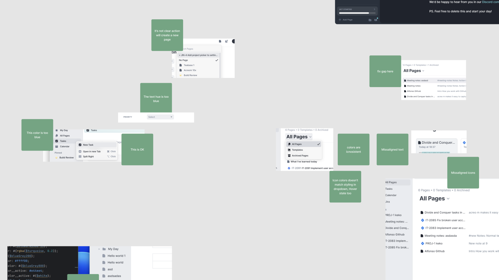
Designer: After the first iteration of the transition was done and we had a rough app in the light theme, we’ve gone deeper into specific details. We’ve used a lot of sticky notes in Figma. Some screens needed to be re-drawn completely. We did visual QA iterations in multiple passes, tweaking colors and seeing what works. Some specific components were useless to match to our defined patterns, so they needed to be customized.
Learnings
Developer
Start with a single component. Experiment and try to find a system that is scalable and maintainable.
Keep all the CSS variables in a single theme file. This way you can easily add new themes in the future.
Naming convention matters. Find name convention for CSS variables. This will make life easy for your teammates.
Designer
Rapid fixes in passes help a lot. Depends on the structure of your team, but overall I think the fluid process worked best. It provided a vital pacing of the project, and didn’t overwhelm and trap us in overthinking. It’s overwhelming, it’s hard, but it works.
Use Color overlays. Before the redesign we used certain shades of color for hover states (bluegrey900 on bluegrey950 background). Bringing an opacity color to our theme allowed us to move faster constantly and look good.
Let us know if you have any questions or would love to know more.
This blog is part of acreom dev week. Be sure to check it out and follow along. Check out also our twitter, or join our Discord community to stay in the loop.