Capturing at Speed of Thought
Most of the workflow management interfaces we use today prioritize organizing before capturing. Working with them often is a burden, and we lose focus simply by having to make sure we put the right information in the right place.
We felt this friction ourselves, hence one of the core philosophies for building acreom is capture-first, organize-later.
Capturing for Developers
Oftentimes you come across a bug or an optimisation you need to do later, or simply want to note something down quickly, but as soon as you leave your IDE, your focus breaks and you lose your flow state, which takes time to regain.
Tools that help us capture issues with context do not provide an easy way to keep us in the flow state. Here’s a brief background on how we thought about designing such a feature from scratch.
Welcome Quick Capture
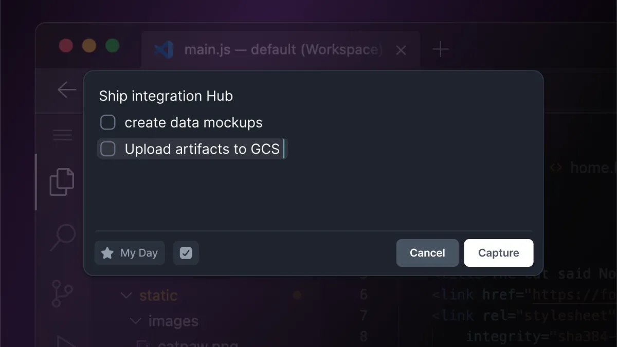
Quick capture is our way to capture your thoughts, not your attention. We address the problems with capturing in the following ways:
Switching context => floating window on top of your current app
Losing focus => everything captured has a clear destination
Losing flow => after writing down your thoughts, you perform a single action - capture
Other distractions => no unnecessary UI. You get an editor and a capture button
The Problem of Version 1.0
The main flaws of the first version was the lack of features. It could capture text to My Day, but that was it. The iteration only included a simple markdown editor. We did have tools and shortcuts to “postprocess” the captured text later in the main app - like convert to task / convert to page, but that required more user interaction than we would have wanted.
The Quick Capture V1 turned out to be too limited in functionality and having to almost always perform a follow-up action with your captured content was annoying. Our own experience and the community feedback made it clear that the functionality needed to be extended in a way that kept Quick Capture simple to use.
The Road to 2.0
We knew from the feedback that the editor in Quick Capture resembled a Page, which suggested that you could: 1. capture a Page, and 2. use plugins - such as Tasks, when capturing. That was exactly what we set out to add in V2.
Early Redesign
The image shows the drafts of an early V2. The capture would be split into 3 “screens”:
Entity picker with a markdown editor - capturing to My Day
Task capture with a simple input and a switch to enable capturing multiple tasks (the Quick Capture would automatically re-open after capturing)
Page capture with a title input + markdown editor
The decision of what you wanted to capture would be made before capturing, but you could always switch between different capture types.
The main problem with this version was the changing content of the whole window. Every capture entity had a completely different screen, which was confusing and overwhelming, especially when switching the different capture types. Furthermore, it put the burden on you to decide before capturing. So we decided to explore a different direction.
Unifying the Content
We have decided to unify the different capture types in order to mitigate the confusion. We have made the header - now with entity type selector (shown above), and the footer persistent across all entities, with only the “body” changing (shown below).
The feeling started to be better, but what surfaced was a problem with Tasks - they just weren’t fitting in with the Page and My Day.
The Problem with Tasks
Our next question was: Why does the Task Capture feel weird?
We came up with a few answers:
The Task capture does not feel and look the same as Task modal in-app, creating confusion
It was missing the functionality to add date / labels
There was no way to include Tasks in text, removing one of the essentials of acreom - capturing tasks with context
The solutions were not great:
We could add page, date, and labels pickers to Task capture, basically making it Not-very-quick Capture and overwhelming to use
There were 3 solutions: add full-fledged suggestions similar to task modal - bad feeling, couldn’t fit the window; make custom suggestions - feels weird and disconnected from app; don’t show suggestion, but show “pills” with parsed data - no user control, could lead to frustration (shown in picture below)
There would need to be a page selector, again making it slow and overwhelming.
One more solution to the tasks is shown below - the picture shows an exploration combining 2 actions - capturing a task, or capturing as the selected entity, covered under a tooltip. We found it only usable for power users, and that it may result in different data input than expected. For tasks you would also be missing feedback - what date and what label has been parsed. It could be done, but we wanted to go with a unified logic, where you capture only plain text.
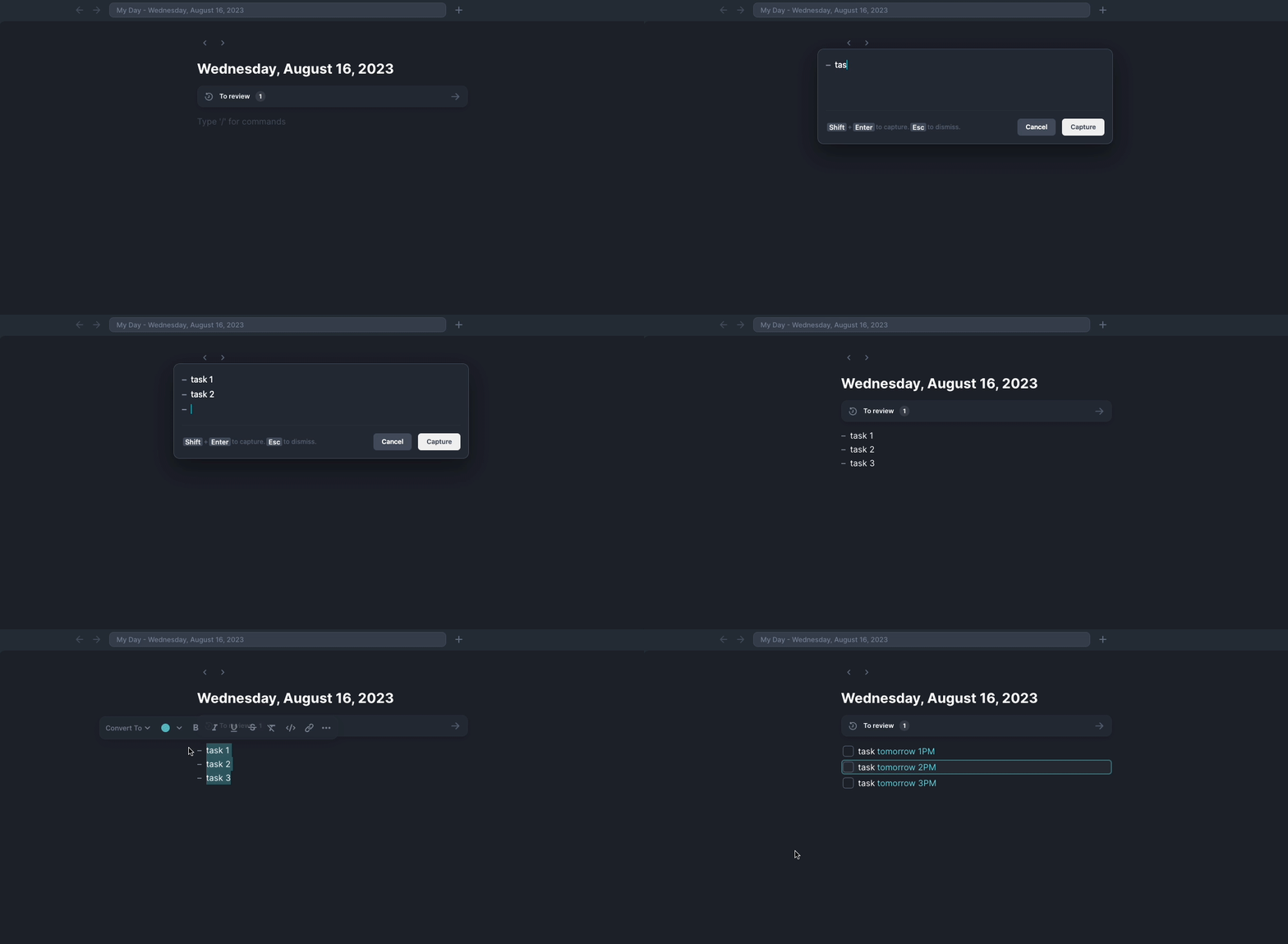
In the end, the solution addressing all the problems mentioned above was simple - remove the Task capture altogether, and move Tasks inline, following our streamlininig principles. The Tasks would then act exactly as the Tasks in the app - you add a Task, get suggestions, accept whichever one you want. You could, naturally, capture tasks with their context, and, the cherry on top - we have removed one decision you have to make before capturing, making it more accessible and flowy. It all just made sense.
Quick Capture 2.0
With the Tasks out of the way, the functionality was mostly finished. What remained was making Quick Capture as non-distracting and easy to use, as possible.
We have unified the capture to My Day and Page capture completely - moving the entity picker to the footer and making the action you perform as clear as possible - “Capture”. The secondary action - cancel is a necessity, as ‘escape’ shortcut to close the window is not known to everyone. We have also added a “add inline task button” to make the tasks more accessible.
We ended up with the bare minimum - a single editor with inline tasks, exactly what you are used to and would expect from using acreom.
In the final version we have included:
Capturing to My day
Creating a new Page
A markdown editor with tasks
A single action to capture
We have not included:
A separate task capturing
Complicated controls
Multiple screens and decision points increasing friction and reducing accessibility
Quick Capture Under the Hood
acreom is a single window electron app. In order to implement Quick Capture, we needed to make it a separate electron window. The window should be displayed above everything, in a place where you would expect it. It should also have a lightweight feel and take as little screen space as possible. That has brought a couple of technical challenges.
Display
Displaying an electron window above all other apps and hiding OS controls is straightforward. Simple config does the trick:
new BrowserWindow({
   title: 'Quick Capture',
   show: false,
   resizable: false,
   movable: true,
   minimizable: false,
   maximizable: false,
   closable: false,
   fullscreenable: false,
   autoHideMenuBar: true,
   frame: false,
   transparent: true,
   opacity: 1,
   alwaysOnTop: true,
   titleBarStyle: 'hiddenInset',
});
Displaying Quick Capture Where You Expect It
One thing to make the Quick Capture experience seamless is displaying it in the most convenient place: the screen you are looking at, and the position where you would expect it - exactly where you left it the last time.
In the early versions, quick capture was always shown in the center of your main screen. This turned out to be inconvenient - you had to switch context, and was confused when not seeing it on your secondary display. Lucky for us, electron has a way to check which screen is focused - more specifically, which screen the cursor is on, by calling the getDisplayNearestPoint method with the current pointer position (obtained by getCursorScreenPoint).
Not having to switch screens when capturing was a great improvement. A problem has arisen though - not all screens are made equal (in their resolution), and if you dragged the QC on a larger screen, dropped it out of bounds of a smaller screen, and tried to display it, it would not show - the image illustrates this perhaps better than words.
To solve the problem, we needed to recalculate the quick capture coordinates relative to the new screen before showing it. We used the following approach:
Get the screen with pointer - as described above
Get the original screen the window was shown on - using
getDisplayNearestPointto the windowNormalize the window position according to the old screen space - calculating for the x coords we get
normX = (qc.x - window.bounds.x) / window.width;, where bounds is a rectangle containing the bounds of the display.Multiply the normalized position with the new window dimensions to get the final adjusted position - again calculating for the x coords -
x = newWindow.x + normX * newWindow.width;Display quick capture
Now the Quick Capture is showing exactly where you need it and also expect it.
Sizing / Resizing
When the content in editor overflows the window, an event with the new content height is emitted to electron. Electron then resizes the Quick Capture window accordingly.
// on Frontend
resize() {
   window.electron.resize(
      editor.clientHeight ?? 235,
   );
},

// in Electron
ipcMain.handle('resize', (_event, height) => {
   if (quickCapture.isDestroyed()) return;
   quickCapture.setMinimumSize(
      quickCapture.getSize()[0],
      height,
  );
  quickCapture.setSize(quickCapture.getSize()[0],height);
});
Platform Specific Challenges
Different platforms have technical limitations with regards to windows and app focus management. We’ve had to make some workarounds for specific platforms to deal with them.
Windows Tray
We do not expect users to have acreom always open. However there are some features that users expect to work even when acreom is closed, like notifications, or invoking the Quick Capture window.
We have enabled tray on Windows to address this issue. Having the app present in the tray will keep the global shortcut bound and the user can invoke Quick Capture. Adding tray functionality to electron apps is easy. Read more.
Note: some users do not appreciate apps inserting themselves into the tray, so we have added an option to disable having acreom in the tray.
macOS Focus Handling and Fullscreen Apps
While working on Quick Capture - a floating window, which could show above the fullscreened app, we have encountered an interesting issue. Upon closing the Quick Capture, the acreom main app was always being focused, instead of the correct app - the one underneath the Quick Capture window.
Turns out, there is an issue with the electron window not returning focus correctly on mac - https://github.com/electron/electron/issues/5495 . The trick to solving is to treat quick capture as a screensaver. When closing, you hide it by setting the opacity to 0 and sending hide: command to the first responder.
Another problem that has come up was the Quick Capture window couldn’t render over fullscreened apps. The result was, your desktop was switched whenever you wanted to capture. To deal with that, we set the window to screen saver. Combined with removing the app from the tray before rendering the window for the first time enables it to render over fullscreen apps.
After you render the window in screen saver mode you can once again show your app on the tray. You will of course always have another window on the background but since the opacity is 0 and mouse interactions are also disabled, you won’t be able to interact with it other than through the keyboard shortcut.
Final Words
We hope you find this blog useful. This is how we approach product building at acreom. If you like this style of blogs, have a look at The Quest for a Great Search.
We’ve introduced Quick Capture in v1.8.0, you can already try it out after downloading acreom - acreom.com/downloads. Tweet us what you think @acreom!
