acreom Tabs
Let's dive into our Feature highlights series.
It's a series of brief posts where you can enjoy behind-the-scenes of some of the newly released features in acreom.
Here we reveal our thought process, design choices, and practical and technical aspects that make them noteworthy.
Sharing all our inspirations, wins and fails along the way. To give a deeper perspective on all functions and purposes of what we are building.
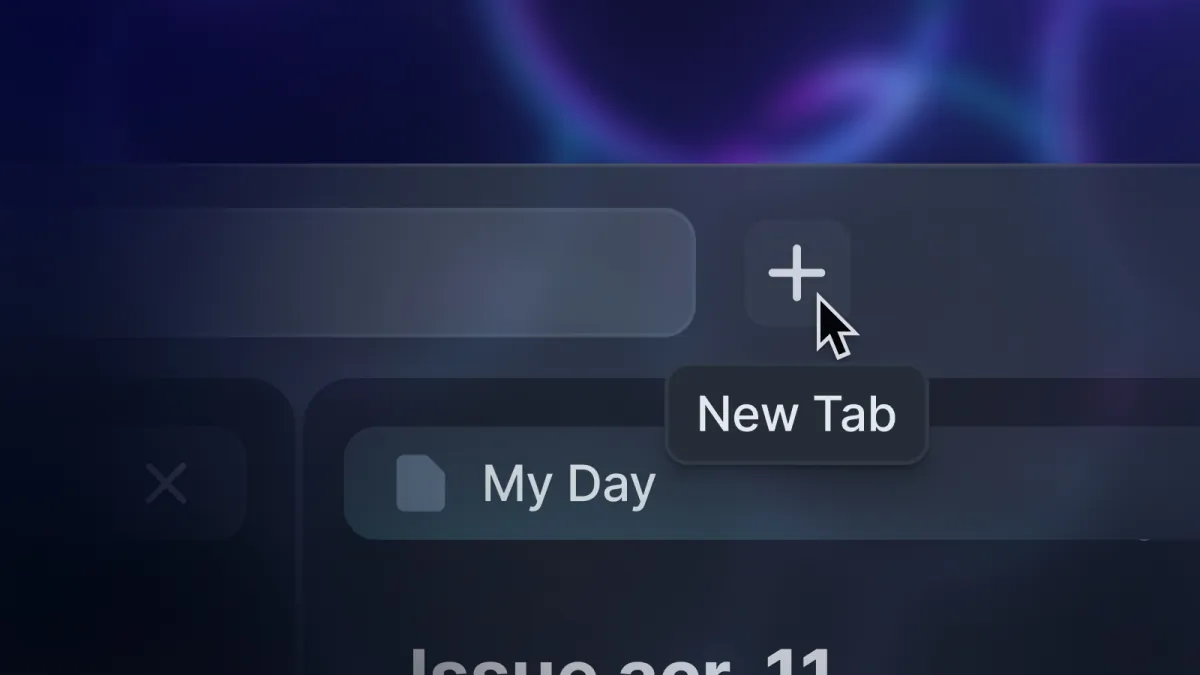
We have spent the last few weeks designing and prototyping tabs with a goal to ship a delightful IDE like experience for your knowledege base.
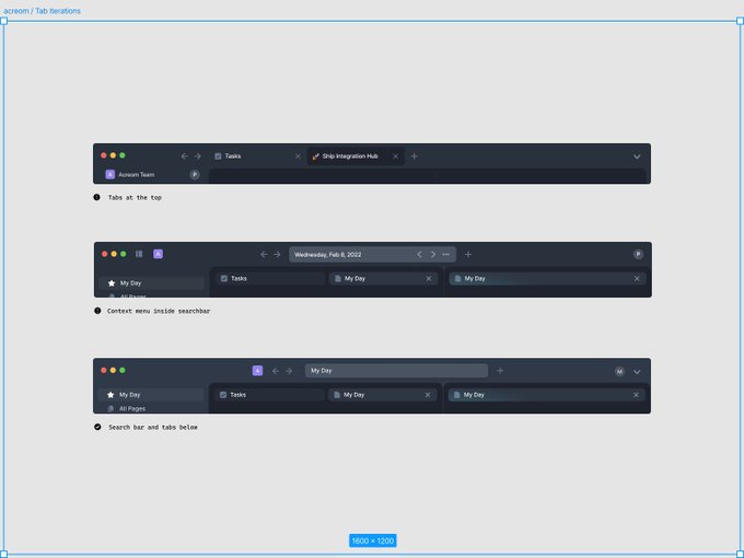
The early prototypes of tabs have shown some drawbacks, such as low-drag areas on top, limits on maximizing screen space and side-by-side view can be hard to differentiate. Most importantly, it created a "tab problem" where users only work within open tabs and never close them.
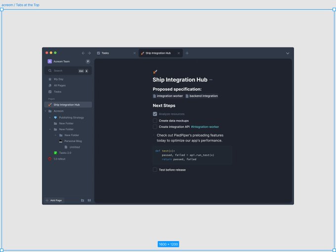
We've gone through multiple iterations, including the combination of search bars as a main navigational element, but the search bar and tabs below have proven to work the best.
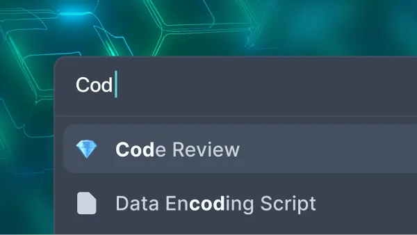
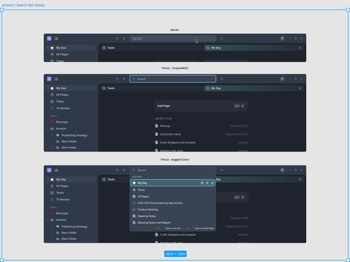
The search bar is fully functional. It provides in-app navigation with recently opened pages and a fast new page creation experience.
That's it for now. We hope this update makes it easier to access and manage your knowledge base.
As always, let us know what we can do better.
